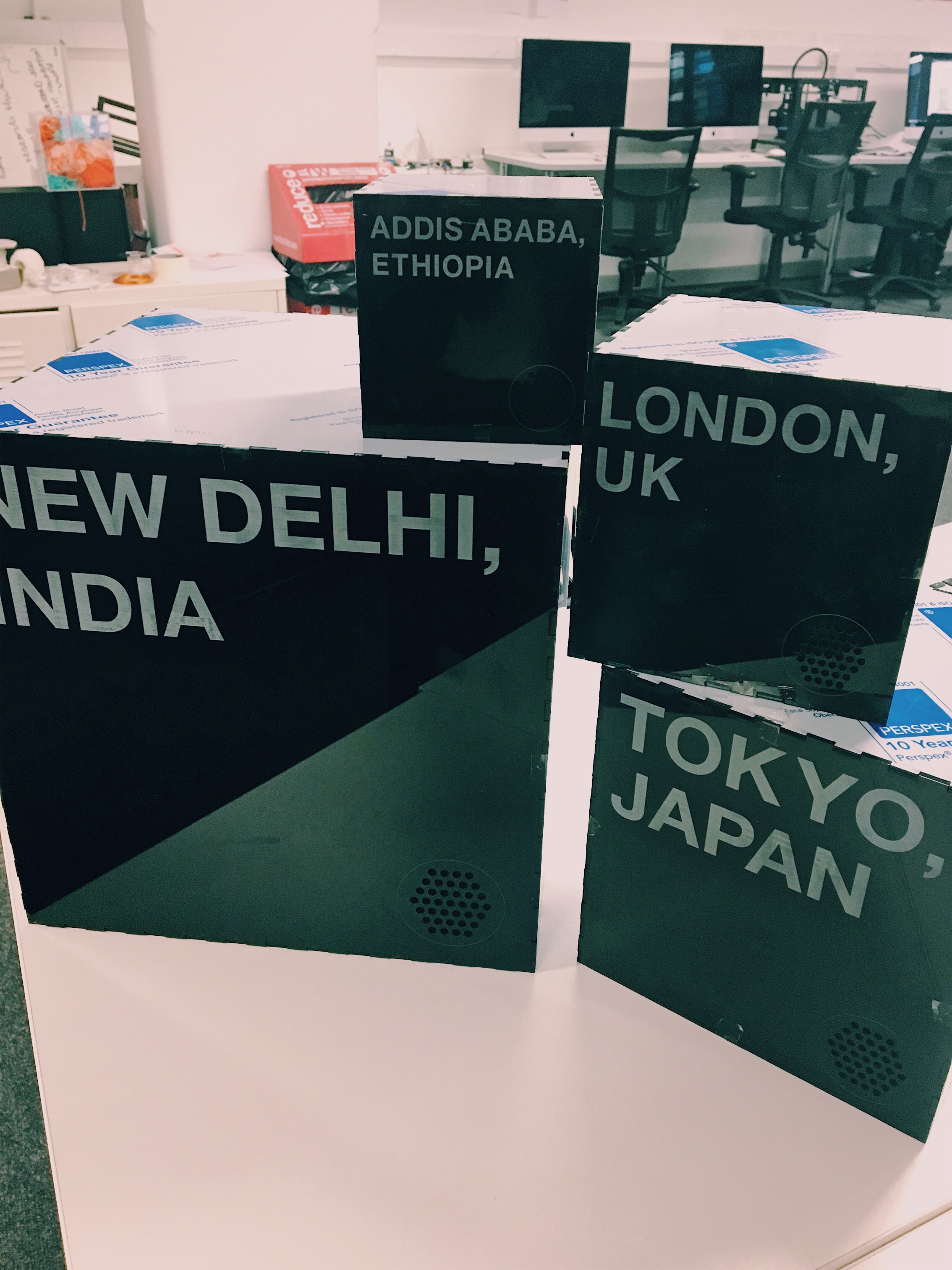
I have produced my final outcome which I think was successful.
The interaction of the boxes work efficiently and according to the infographic. The aesthetics of the box worked well against the boxes as it was unknow to the user what the senses where.
If I was to change anything it would have been the material of the boxes. I would have used acrylic still but possibly made it matt instead as when the plastic was removed from the boxes, the base instantly got scratched.
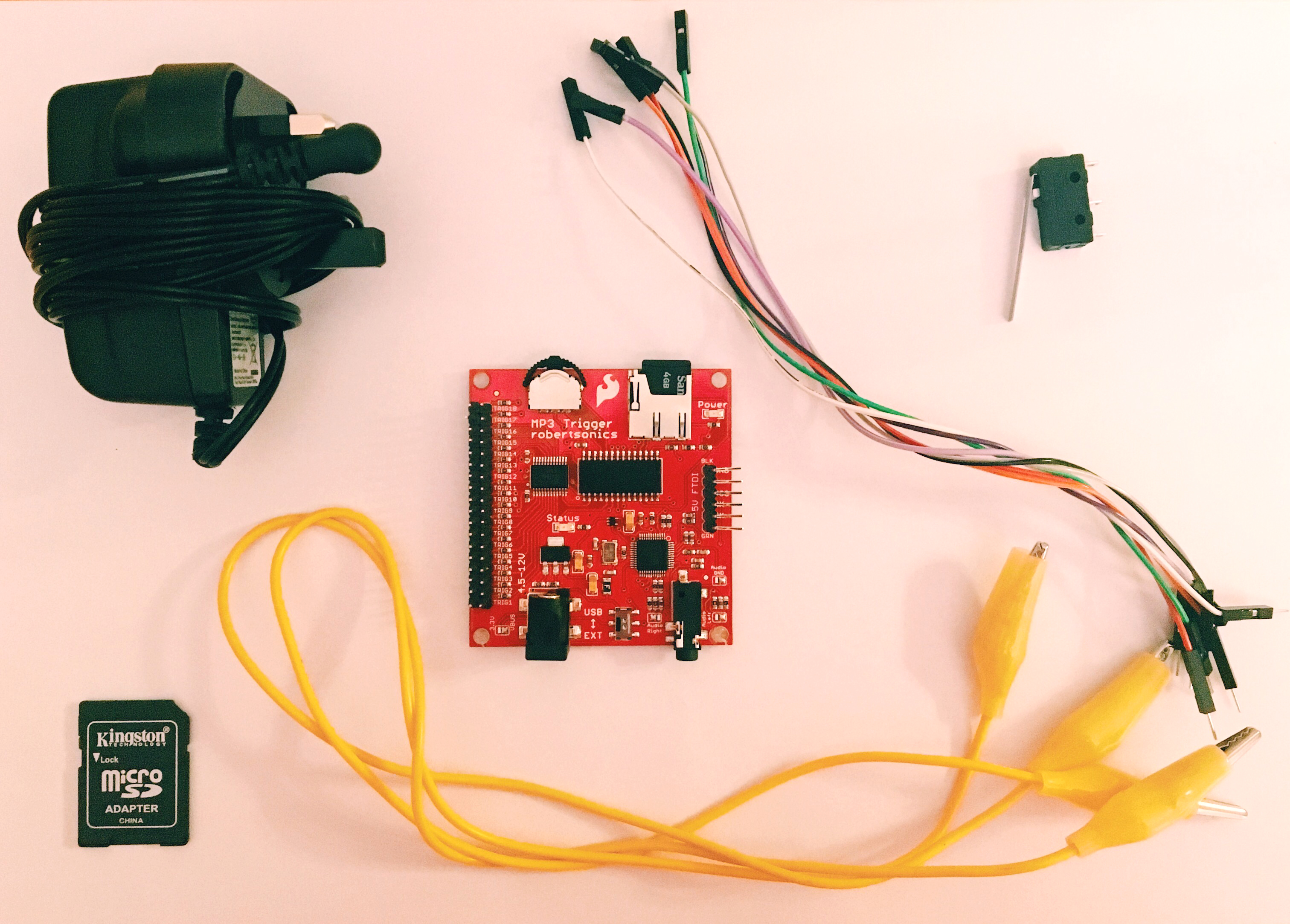
Previously I was able to get the sound working using an Sparkfun MP3 Trigger. At the moment when the trigger is pressed it makes a sound. For my boxes to work, it needs to do the opposite. When the boxes are laid onto the trigger and when the the user picks up the boxes the sound plays.
I went to CTL to find out how to change this. They mentioned using an Arduino to do this change.
Setting it up:
Throughout my projects, I haven’t used Arduino so I was unsure about how to produce the code, luckily I was able to get help in this. Unfortunately, there were some technical issues which the technicians were not able to figure out. But we plan to get this sorted tomorrow.
Other updates:
I have not been able to come up with an idea for taste but I plan to have that complete for the exhibiton. I have had some thoughts, such as sweet/sourness of a type of data.
I am yet to print out my infographic but it will be on poster card.
Through the creation of the boxes, the lids have become scratched due to wear and tare which efftecs the overall look of the boxes. For the submission I will tape these down but they will be laser cut for the exhbition.
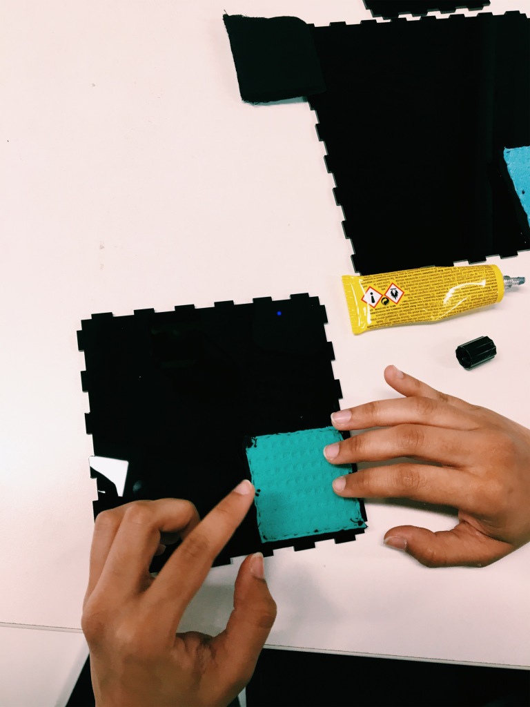
To each of the different sizes squares, I applied a thin black cotton material as the sponges were made up of multiple colours which wouldn’t have matched the layout and colour schemes of the box.
Applying cotton over the sponges didn’t make a difference to the amount of water added because that itself has a good water intake. I trying testing these on the boxes, sticking them down with masking tape to see how they would fit and if the lid of the box would fit correctly. It worked.
To glue these down I will apply UHU glue to the edge of the sponge as well as apply duck tape to keep the secure as possible.
Using the nets I created yesterday I got the lids laser cut/engraved. I am extremely happy with how they turned out, better than I expected. I was able to get the dimensions exactly to the size of the text and the smell was well sized a proportioned to the whole box.
Smell:
Smell represent the level of energy consumption in each city.
London: 309 billion kwh
Tokyo: – 64 billion tons
New Delhi: 114 billion kwh
Addis Ababa: 9 billion kwh
To produce the smell I have chosen to use coffee as it is a source of energy and works well when making the different intensity of scents.
Coffee ratio: 1 tsp spoon = 20,000 kWh
London: 15.5
Tokyo: 3
New Delhi: 6
Addis Ababa: 1/2
Water ratio: 1 : 2
London: 30ml
Tokyo: 6ml
New Delhi: 12 ml
Addis Ababa: 1 ml
In terms of adding the smell, I have bought a packet of 30ml dropper bottles which I can pour into each hole. This will not only for easy access in adding more of the sent but allows me to glue the lid down onto the box.
I tried representing these measurements but it was too difficult for the water to keep it in a liquid state due to the amount of coffee that needed to be added. Each bottle that will hold the coffee is 30ml, instead I will take that amound and added the right amount of coffee to this.
In regards to the material, I have changed it from foam to makeup sponges.
I wanted there to be some thickness to the sponge so that it could take a lot of the smell but I couldnt find anything like this. It also didnt help that the sponge was white, it needed to be black.
However I was still having problems with the time took to soak up the water. I tried to find alternative ways to findouther materials that would soak up the water better. I decided to try a washing up sponge. I tested how fast it would take for the water would soak in, and the washing up sponge worked instantly, compared to the makeup sponge which the water just layed there.
The washing up sponge was the best to go with.
The sponges were large squares so I cut them down according to the size of the circle. I reprinted the nets to figure out the sizes and made sure to add at least 2cm to each size. I made sure to leave a border which gave more surface area, it also allowed for enough space to glue them down without them running into the holes.
I went back to the drawing board and decided to make up some more designs for the lids of the boxes.
I chose to enlarge everything and look at different placements using the same elements of the first prototype. I still wasn’t too happy with how large the circles were so still keeping a circle form I decided to use smaller circles in a repeated pattern.
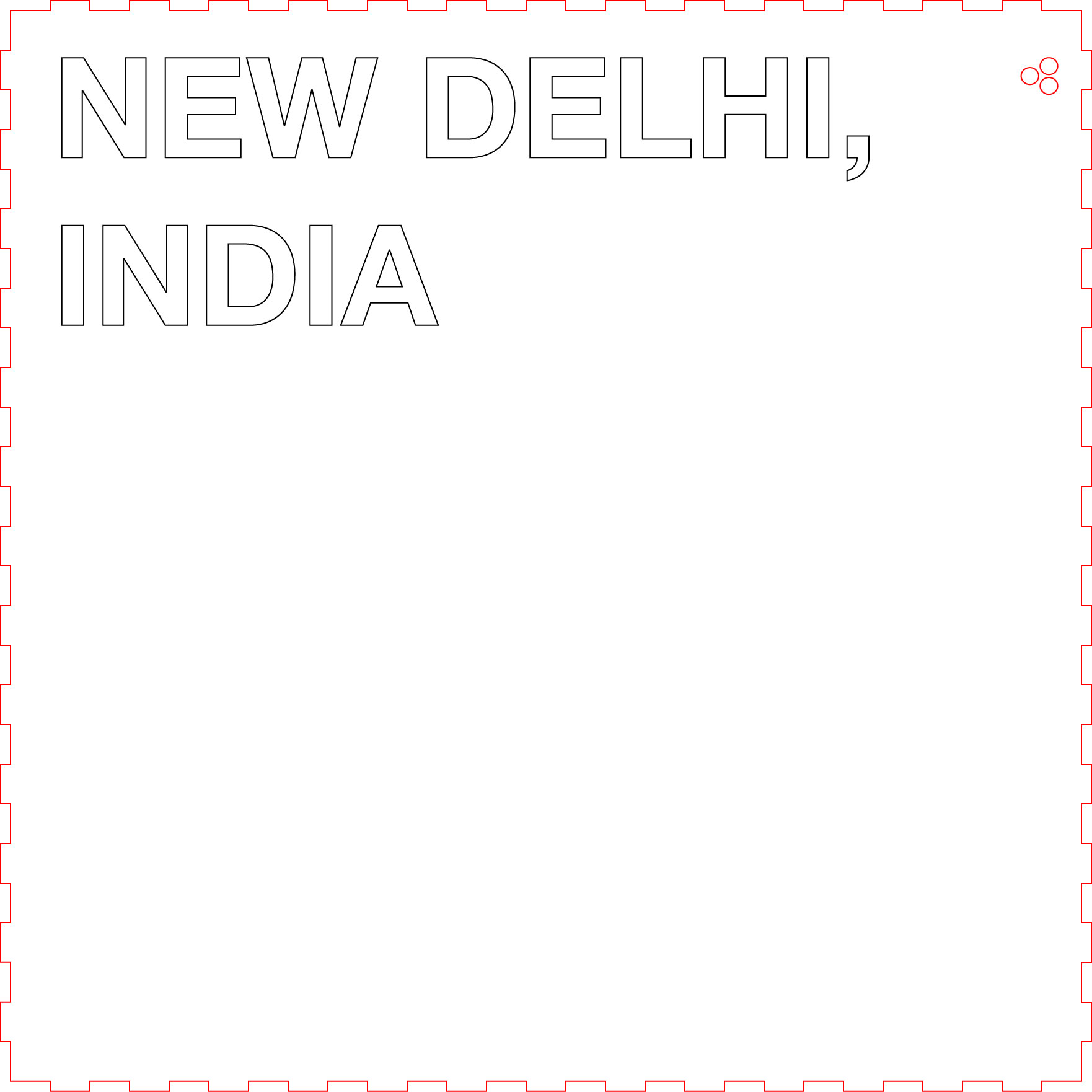
To this new design, I have enlarged the cities to a larger size so that it fills the width of the lid. I have produced a new design for the smell, rather than three circles I have created a repeated pattern which I think looks better in terms of aesthetics. To this pattern, I have added a circle around it to signify that there is a sense there – the inforgraphic states this too.
To test this and see what it looks like physically, I printed it to check proportions.
They looked good and were ready to get cut. I plan to get the letters and large circle engraved into the acrylic and the smaller circles laser cut.
Previously one face of the box was going to have the city, country named as well as an illustration of it as a map. These were going to be vinyl transfered onto one face, however, I realised this wasn’t going to work.
As I had planned to get them printed and transferred on to vinyl, transferring them properly on to the box would have been extremely difficult, especially the individual sections of the map. It also did not help that all the boxes were glued together, so it restricted me from engraving any and I needed to apply a design to the box that would allow for the smell.
The lids of the box still needed to be made, which meant my only option was to apply these designs on to that and move the weight to a different face inside of the box. I was very lucky that the movement of modelling clay was very easy as if I added cement I would have had to start from scratch. With this being said, I needed to design an additional element of smell into the lid of the box. I wanted it to be placed, again to the top face of the box but ultimately couldn’t be able to do this because of the faces being stuck together.
Designs:
After receiving feedback, a suggestion was to remove the map of the country as it wasn’t nessessary to have this and looked better without this, I agreed.
It was an advantage to removing the map as I was able to add different elements, in this case smell. I decided to add three circles to the top right of the box next to the letters
I kept all the sizes of the circles the same size across all four boxes.
Laser cutting:
I got the nets laser cut.
I decided to test how the smell would work with is. I bought some black foam and cut it and attached it to the back of the lid.
Unexpectedly applying the foam did not work and the glue ran through the circles which ruined the front of the lid. Also, the surface area was too small which most likely was the cause of this. As for the foam, I will need to buy something or cut it into a cube or a circle so that there is enough space to glue it down and evenly distribute the smell. I am yet to decided what smell I will be using.
Overall, I wasn’t happy with the outcome, the circles are too small it looked very cramped which affected the overall look of the lid. Keeping all the circles the same size doesn’t work as it throws the proportions off, especially on the New Dehli box and getting any smell through a very small area may be too difficult. Also, some the boxes where not draw up to the correct size so it did not fit the box correctly.
I learnt a lot throughout this stage of production through prototyping and understanding how important layout is.
Sound relates to the rise of sea levels in each city.
London: 11 m
Tokyo: 40 m
New Delhi: 216 m
Addis Ababa: 2.5 m
To produce the sound I changed the pitch to represent how bad it is. I used Audition to manipulate the sound. I extended the sound by repetiting the pings to 1 minute
I found it extremely difficult to use the data accurately to the level of pitch. I decided to apply the effect myself by keeping the data in mind but manually moving the pitch.
I would like the sound to work by lifting each box which will trigger the sound to play. I visited CTL to gather/ find out what materials are needed to make this.
Sound:
I took the audio and transferred it onto the micro SD card and into the Sparkfun
Components:
Sparkfun MP3 Trigger
Audio
Trigger
Crocodile clips
Wires
SD card
Plug
Putting it together
Testing:
I was able to get it working, however, it did the opposite trigger that it needed to be. I also realised that having the sound on a loop for one minute was too long, I have reduced this by 20 seconds. At the moment when the trigger is down, it makes the sound. The boxes to be resting down on the trigger and when the box is picked up it should make the sound. I will need to seek some help from CTL to sort this out. Once this has been figured out, I will get more equipment, like triggers to produce more than one sound.
Now that the boxes have been made the senses can be added I started off with weight. Weight refers to the amount of CO2 in each city.
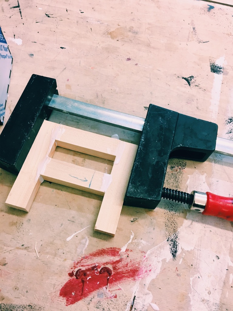
During my time at the 3D workshop, I discussed the possible ways of added weight to the box that could not make a sound. It was suggested that I use cement, sandbags or wood. However, I was unsure whether these were the best ways of applying weight as there would be no way in which changing the measurements later on.
After talking to my peers it was suggested that I use clay or material that could be easily manipulated if problems did arise. I went with this suggestion.
To the boxes I applied sealant to stop the boxes from coming apart.
First I gathered the amount of CO2 in each city
London: 44.6 million tonnes
Tokyo: 59 million tonnes
India: 64.4 million tonnes
Adis Ababa: 0.119 million tonnes
I have decided not to add a weight to Addis Ababa due to it being a very small amount.
I weight all four boxes without the clay:
London: 450g
Tokyo: 770g
New Delhi: 1.8kg
Addis Ababa: n/a
Using the ratio: 1kg = 20 tonnes, I got the overall weight that should be added to the box from the CO2 data
London: 1.1 kg
Tokyo: 1.5 kg
India: 3.1 kg
Addis Ababa: n/a
From here I subtracted the overall weight of the box to the amount of clay that should be added
London: 650g
Tokyo: 730g
India: 1.8kg -1.2kg
Addis Ababa: n/a
Total amount of clay: 2.6kg
I got the total amount of modelling clay, weighed them and glued it to the box.
Overall this was very successful and worked well. I was able to apply the weight accurately.
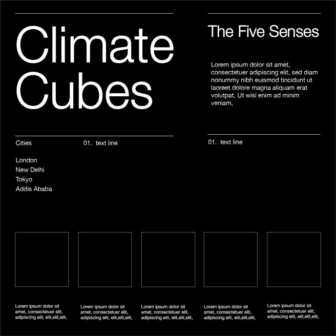
I mentioned previously about making an infographic to inform the user about how the senses work within the box. I have started to design some outcomes that could be developed further.
Initial designs:
I have created a set of different ideas based on my initial design.
Initially, I thought about adding icons to represent the five senses, however I concluded that the main illustratons should be of the boxes to explain the use of it.
I have changed the layout and font sizes throughout these infographics.
Through this development, I reduced the size of the infographic to the biggest size box which was 298x298mm. I explored different layouts and font sizes but stuck with the same colour schemes and font. I did this in mind of the exhibition, the infographic will be hung next to the boxes. I wanted all the different elements to work well with one another.
Testing:
I produced a prototype based on my best design and printed out the poster to see how it looks in real life. I am happy with it and it is legible. I may improve the size of the title by reducing it as I want the subheading to be the most eye-catching.
Final Outcome:
I have used a simplistic black and white colour scheme and layout to match the layout of the boxes. Also, I have changed some of the text that informs the use of the box, such as smell as it fits better and makes more sense and re-written the paragraph stating what this is all about. As for the font I have used Helvetica Neue across all of my designs as it is legible and easy to work with within the design. The font alongside the images provide an easy and well understood set of action that should take place when interacting with the box.
I plan to print this as a poster for the submission but for the exhibition I will have it engraved onto black acrylic and hung on the walls.
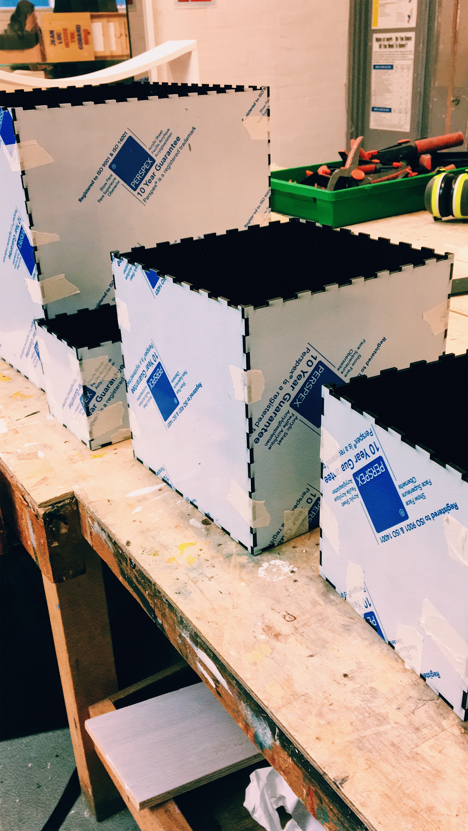
Using illustrator I have scaled my boxes to size as well as printed them to see them before they get laser cut.
Through this simple prototype, I recognised that the difference in size was able to show the dramatic change in population and that the size of the boxes was manageable for the user to pick up. The sizes were good and they didn’t need any adjustments.
The laser cutting process began. Once they were cut, I glued them together. I decided not to get the lids cut just yet as they were still being designed and needed further development for the other senses.
I have started to think about how the lids may be designed. I thought about the lids having the name of the city and country, and for aesthetic purposes adding a map to show the location of the country with the capital city highlighted.
I am yet to decided whether this will be my final design for my boxes.
To begin with, I have produced a ratio in order to create an accurate representation of the population to the size of each box.
Ratio: 1 million = 1.5cm
I have rounded the population to make it easier when calculating the sizes.
London: 10M population = 150mmx105mm
Toyko: 13M population = 195mmx195mm
New Delhi: 22M population = 330mmx330mm
Addis Ababa: 7M population = 105mmx105mm
I created 4 nets using the Maker Case website.
I plan to make these next week.
Thoughts:
As for colour schemes, I thought it is necessary to make the boxes opaque black as there will be different components that shouldn’t be seen, for example, weight. This also affects the use of the box as the senses won’t be seen by the eye which means the user will have to pick it up and interact with it.
This has also informed an additional area, which could possibly be an infographic which explains how each sense is used when interacting with the box. Within this graphic, it will contain a set of images that refer to each sense and explain how they are being used.